REBRAND & WEBSITE: A New Era, A New Look for DS Jewellery
- Taylored Creative

- Aug 6, 2025
- 1 min read
Updated: Nov 13, 2025
After seven years in business, DS Jewellery is stepping into an exciting new chapter with a brand identity that’s as vibrant, intentional and handcrafted as the pieces Di creates.


This fresh start came from a desire to refresh, refocus and streamline the brand, to reenergise it and better reflect who DS Jewellery is today. What started as a general jewellery service has grown into something much more personal. From her Wheatbelt farm studio, Di now connects with clients who want to create jewellery that tells their own unique story through custom design.
Here's what the rebrand covered:
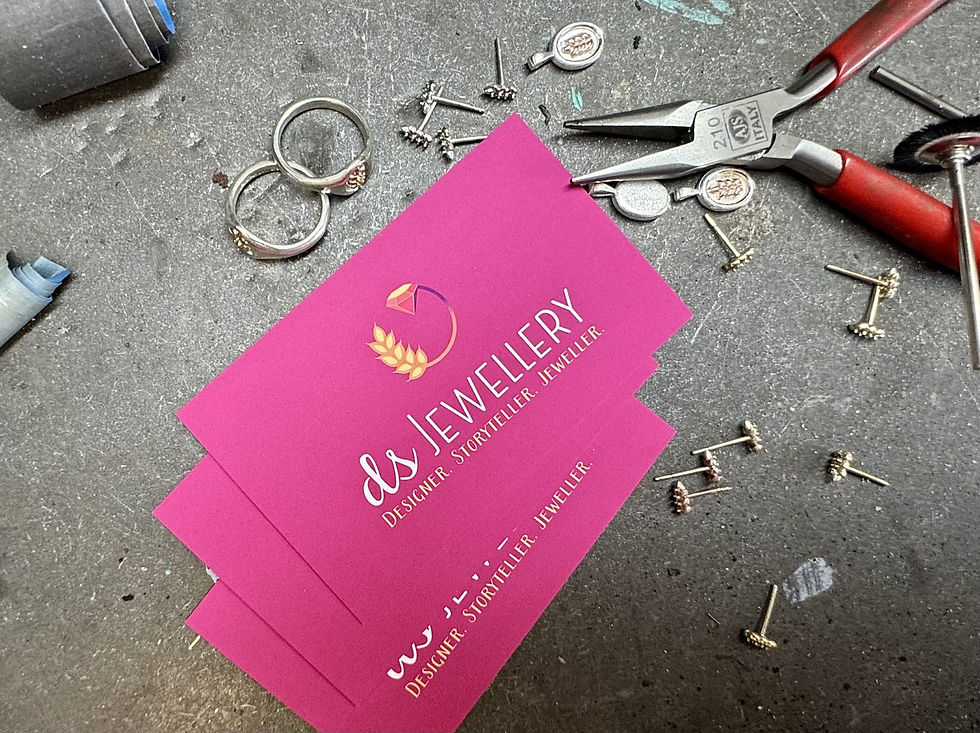
A new logo and full logo suite
A refreshed tagline: Designer. Storyteller. Jeweller.
Social media templates that bring consistency and colour online
New business cards that match the fresh new look
And a website (coming soon!) to share Di’s story, streamline enquiries and simplify processes


Why a wheat stalk and a diamond?
The wheat symbolises Di’s connection to the Western Australian Wheatbelt
The diamond reflects the brilliance of fine jewellery
Together, they tell a story, just like each piece DS Jewellery creates
And there’s more! The contrast between the soft, organic lines of the wheat and the sharp, polished edges of the gem highlights the individuality of Di’s designs - no two stories or pieces are the same.

Rebranding is a very exciting time! Wishing you all the best with this next chapter, Di!
Want to see more TC branding projects?
Want to have a chat about your branding? I'd love to hear from you!


Comments